Overview
We provide a number of custom page templates that campuses utilize to achieve specific page design goals. You should be familiar with each and be able to assist Editors with guidance on how to prepare and save the right page layout and presentation the site requires by selecting appropriate templates when page building. There is a set of standard templates available for any page and special templates designed to work with several UMS Custom Post Types when those features are enabled for the site.
Please review the Page Creation Process before diving in, here.
Select a Page Template:
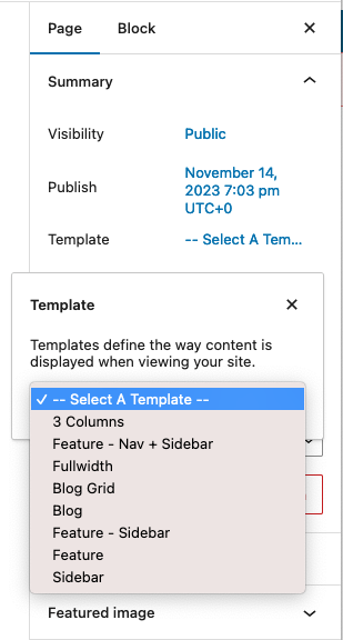
- Create a page.
- Give it a title and select the page template within the “Summary” panel.
- Optionally, decide on Parent Page, Order in the Page Attributes panel.
- Save the page and reload the screen to see the selected template options below the editor’s canvas.
- Decide on these options and save the page to preview it.
Standard Page Templates
Additional page templates exist and may be available, depending on features that may be enabled in your site. Templates for People, Directory, Portfolio, and Academic Program Grid are each explained in their dedicated documentation guides.
Blog
This template relies on Posts existing in the site. A featured image for each post (if attached to blog posts) can be displayed with articles. Excerpts (or full articles) will display in a list format with pagination at the bottom of the page. “Read More” links will take visitors to the full article. A sidebar can also be enabled.

The example above shows excerpts of News-categorized posts with a sidebar enabled.

On mobile devices, sidebars and multi-column page layouts will show the main content area first, then the sidebars.
Blog Grid
Similar to the Blog template, but is used with article excerpts which flow across and down the page, as configured. Here is an example from UMA News:

Choose configuration options for article category, order, posts per page, columns, and sidebar once you save the page template assignment:

3 Columns
This template enables 2 sidebars on either side of the main page content. A feature presentation is also available above the content. Maine Law’s “Why Maine Law?” page uses this template:

You may place any saved widget area into the column slots via the additional page options below the editor’s canvas:

If your sidebar setting in Theme Options > Main Settings is set to LEFT side, the “Main Column” is the left side (often filled with a subsite navigation menu widget). The “Additional Column” would likely contain additional content.
In this case, on mobile devices, the main content would come first, then the “Additional Column” content, and lastly the “Main Column” content.
Sidebar
The Sidebar template offers an option to add a sidebar to the main content area of the page.

After saving the page with “Sidebar” selected
The example above shows the sidebar is on the left side. This is configured in Theme Options > Main Settings:

Now, choose from among the created sidebars in the site with the Sidebar Options panel below the editor’s canvas.

Feature
The Feature template provides for a visual presentation to be placed above the main content area created in the editor’s canvas. This presentation could be a hero-type (“Featured”) image, a carousel / slide show, or embedded content, such as a Google map or external video.

In the above example, a slideshow is used as the featured object.
Here is a view of the feature options below the editing canvas after selecting that template and reloading the edit page screen:

Feature – Sidebar
This is a very popular template. This template enables a feature presentation above the editor’s content and a sidebar option. Here is an example with that template in use. The moose is the featured image. Sidebar on the left.

With this template both feature and sidebar options appear below the editor’s canvas. On mobile screen widths, Feature – Sidebar displays all the sidebar content below the main content.
Feature – Nav + Sidebar
This template offers options for a feature component above the page content and with Navigation and Sidebar options in a left or right column. Nav + Sidebar splits the sidebar column on mobile so that the nav section displays above the main content, and then the rest of the sidebar displays after the main content. Note – only one navigation menu will reside on any page of the sub-site that uses this template (different navigation menu widgets can not be used on different pages of the sub-site).
Fullwidth
The main content area will fill the entire width of the page (- any padding attached to the content container). No special options come with it. Let your creative juices flow and get editing!